UX CASE STUDY
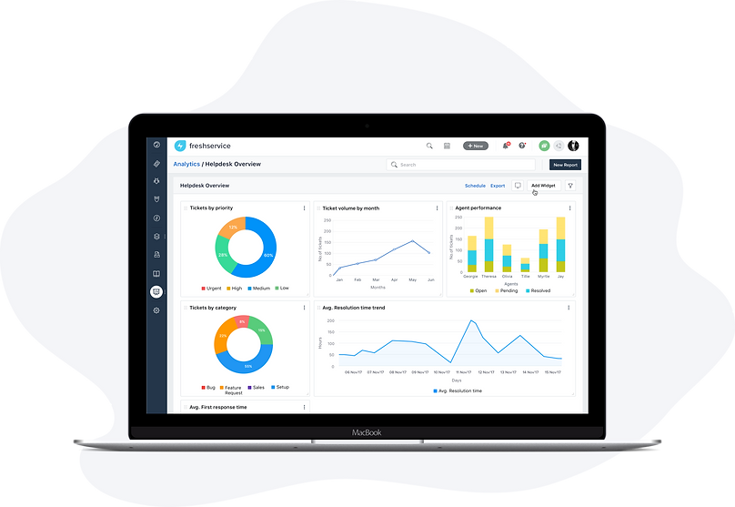
Reporting and Analytics in Freshservice
Monitor service desk performance, Gain insights into all modules, and Visualise and interact with reports.
Overview
This is a quick look at one of the more significant projects I tackled as part of my work on Freshservice, a cloud-based IT Help Desk and service management solution that helps organizations to simplify their IT operations.
Aimed primarily for Account Admins and Supervisors, as they need to stay up to date with their IT support and agent performance on a weekly/ monthly basis. To do this, most of our customers relied on BI tools to create the report they want, but the tool wasn't just intuitive, they had a steep learning curve along and required training.
So, we identified having a tool that allowed admins and supervisors to assess the service desk performance metrics was key.
Freshservice already had a very basic reporting module, but with a lot of limitations, So we decided to extend the reporting module to have data analytics, reporting and visualization tool, which was named as "Analytics".
The Problem
ThService desk leaders are struggling with data today. It’s not because they don’t have data; it’s because they can’t draw meaningful insights from it. We realised something important in conversations with our customers.
"Service desk leaders don’t want to spend a lot of time creating reports; they want to spend time consuming the reports to improve service delivery"
The existing reporting module in the product did not cater to this. It wasn't possible to easily break down insights, quickly see important metrics in their service desk and swiftly act upon it.
The Goal
The existing reporting module lacked in many different ways, We wanted to extend our analytics tool to perform the following:
Reporting across all modules - Since Freshservice is an ITSM tool with different modules for Tickets, Problems, Changes, Releases, Assets, and Projects, It is necessary for the Admins/ Supervisors to be able to run reports across all modules, which allows to measure the overall agent and help desk performance.
Cross module reporting - In order to monitor service desk performance, identify problems, and make decisions within the business, It is important to allow users to view reports based on their associations like impact, group, type, and department.
Pre generated reports - In this consumerized age of instant gratification, search is a default behaviour for most people, Leveraging prebuilt reports in the service desk, so that the user does not have to build reports from scratch.
Build/ Interact with reports - Ability to explore data with rich and interactive visualizations, to perform in-depth analysis of data and surface valuable insights.
Report Dashboards - Categorising report widgets as folders/ dashboards which helps the user to view different key performance metrics in one place, By doing this, the user can visualise help desk performance in real time and make faster, better-informed decisions.
Custom Dashboard - Ability to pin report widgets into the dashboard allowing users to customize the dashboard with useful metrics accodring to the users preferences.
Needs Statement
By having a general understanding of our customers pain points, the next step within the process was finding out what the admins and supervisors needed to see, what are they actually trying to accomplish and why.
We gathered answers for the following questions to ensure we are in the right direction.
1. What are the most frequently accessed reports? or information?
2. What are the metrics that would help them do their job more efficiently?
3. What are the reports to be shipped by default?
4. How can we provide deeper insights on a report?
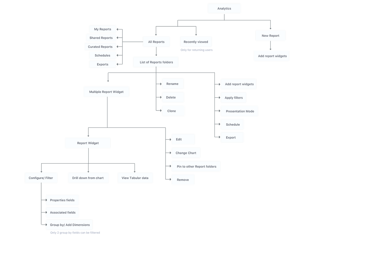
5. Experience for first time user and returning users.
Information Architecture
Sketching
Unlike the existing reports, which is a list view, We changed the default reports view to card layout which lets the user focus on the content and find the content easily because each card will have the report widget illustration, which helps user identify the type of report.


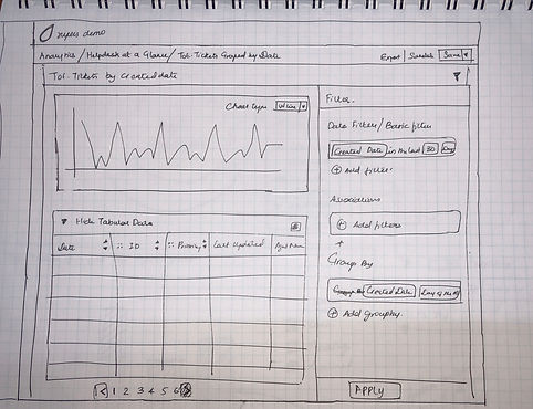
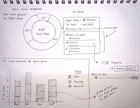

Designing The High-fidelity mockups
During the brainstorming sessions with my peers, we identified areas which needed a bit of improvisation, which I included while designing the feature in sketch app.

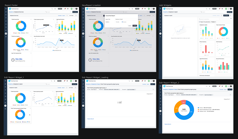
Creating Interactive prototype
Since this project was vast, unlike rapidly prototyping specific screens in order to test particular interactions, It was challenging to create a full interactive prototype. The tool I used to do this was Marvel app.
A full interactive prototype also helps to convey to the development team about certain interactions which is better seen than said.
User Onboarding Process
With the help of inline manual tool, we were able to create a guided tour which educates the users on how to create and consume the reports.

Lessons Learned
The real important lesson I learnt from this project is that the UX is a continuous process, far after the beta release we kept uncovering usability issues and we kept improving, focussed on the tiny details and ensured high standards of user experience.